

Contents:
Shorter-Term Sector Rotation
Sector Bell Curve
Intermediate to Long-Term Sector Rotation
What the Charts are Telling Us About the Health of the Market
Pass/Fail Screen for the 11 sectors of the S&P 500 index
ARTAIS AI Universe Screen Results
Sector Rotation
The technology sector continues to show the strongest positive momentum and relative strength vs the S&P 500 index:
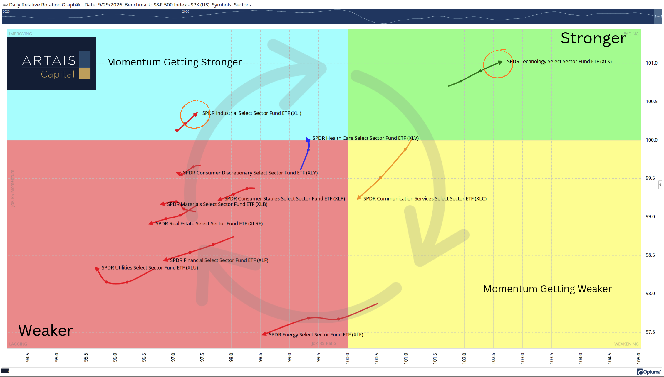
Note that industrials are starting to see improving momentum as well.
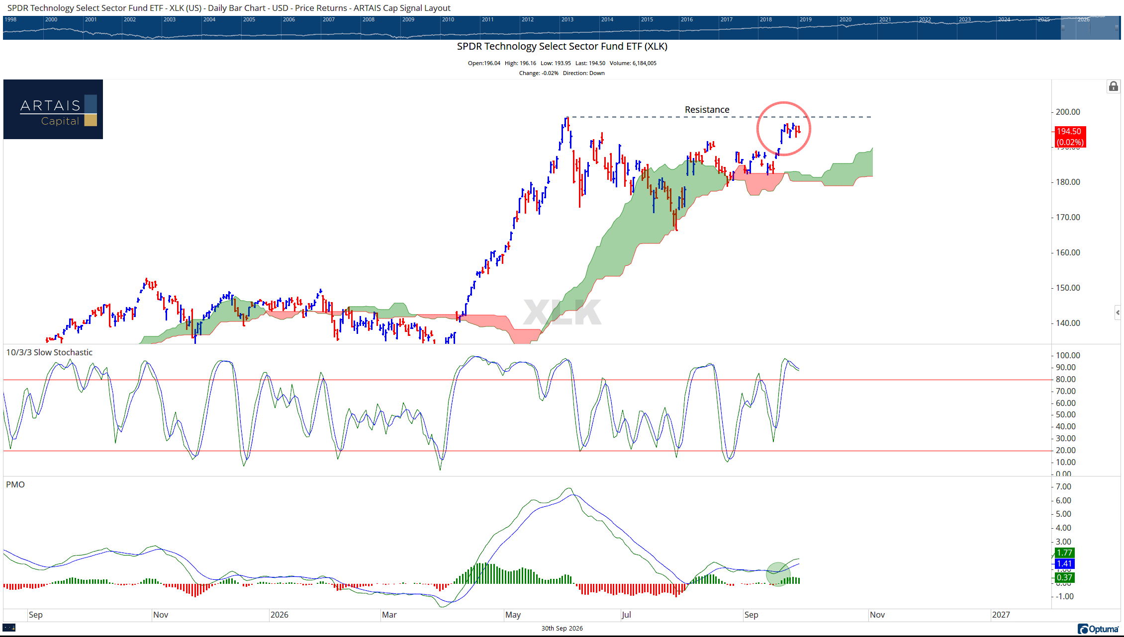
However, if we start to drill down into the charts, we may see a pause in the rise of the tech sector.
Short Term Rotation
Currently, tech (XLK) is nearing overhead resistance and struggling to break above it:
Additionally, the Bullish % Index (which measures how many stocks are in a Point and Figure buy signal) has reversed back into “O”s.
(Think of “X”s as the offense is on the field and “O”s as the defense is on the field.)
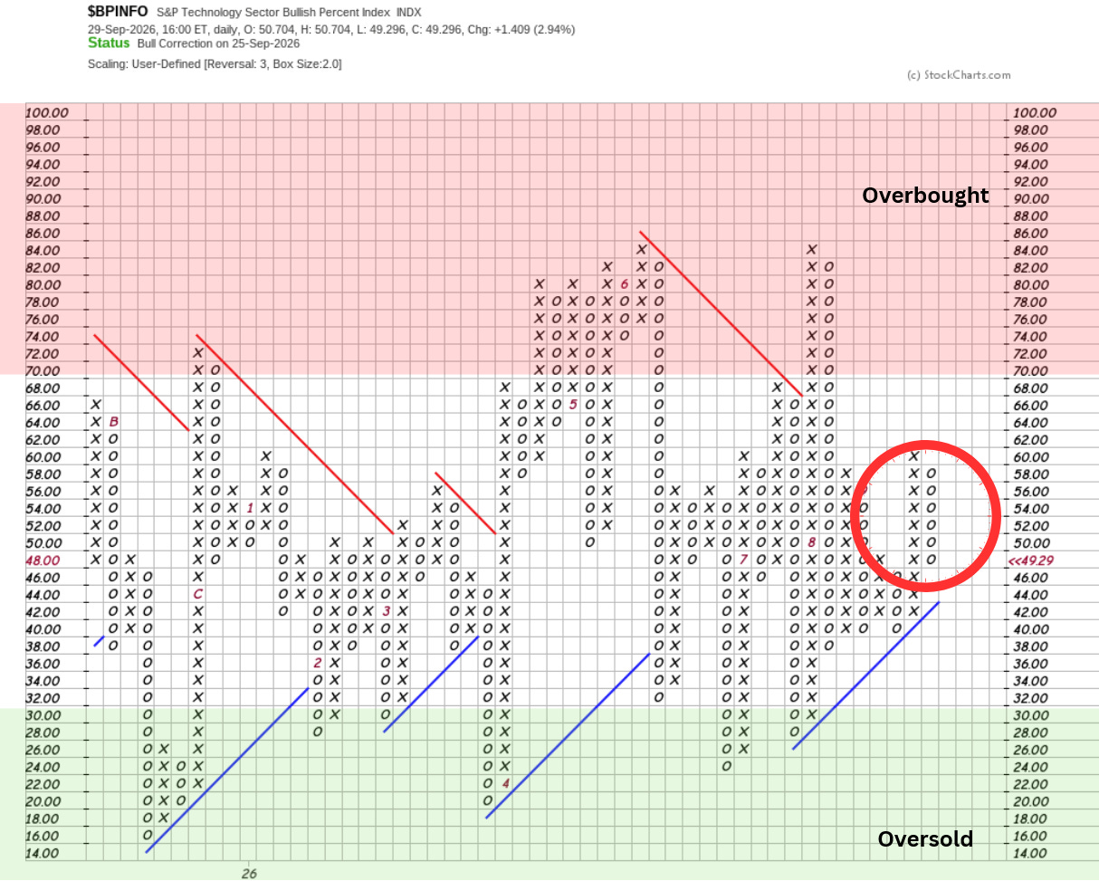
This is indicating that tech investors are taking a pause here - possibly due to rising yields in the bond market and the worry that the Fed is about to make a policy mistake.
If we take the Bullish % Indices of the 11 sectors of the S&P 500 index and place them on a bell curve, we can get a better visual of how overbought or oversold the various sectors are:
