
The Fed Just Went Quiet. Here’s What That Costs You.
Kevin Warsh withheld his dot, trimmed the statement, and signaled the end of forward guidance. The market heard the silence loud and clear.

Yesterday the Fed Said Less, and the Market Heard More
The Federal Reserve did the predictable thing yesterday. It held the federal funds rate at a target range of 3.50% to 3.75% — a midpoint of 3.625% — for the fourth consecutive meeting. That part surprised no one.
It was everything around the decision that was the surprise.
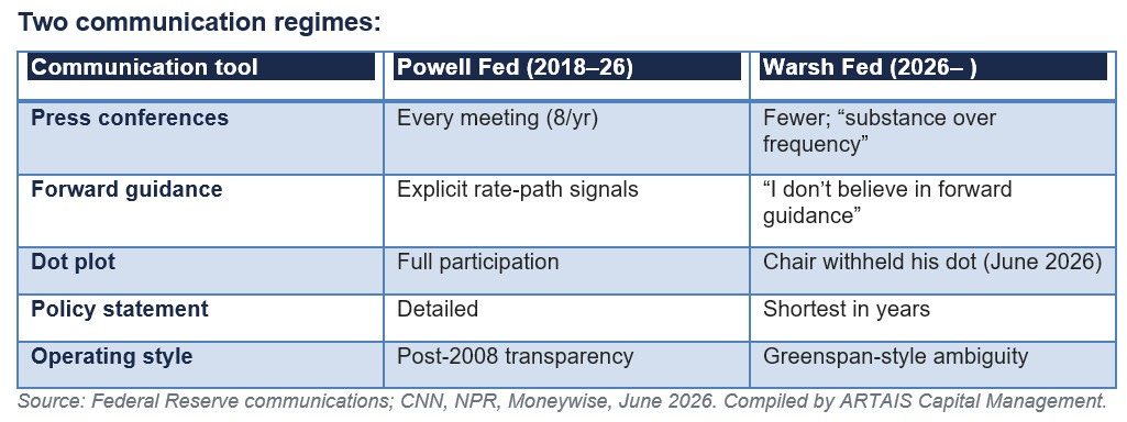
This was Kevin Warsh’s first meeting as Chair, and he used it to change how the Fed talks. The post-meeting statement was the shortest in years.
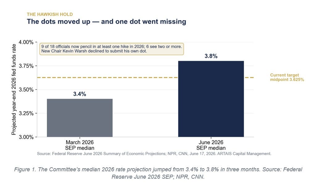
It described inflation as “elevated,” in part because of energy “supply shocks.” And the Summary of Economic Projections turned distinctly hawkish: the median official now sees the funds rate ending 2026 at 3.8%, up from 3.4% in the March projections and a quarter-point above where rates sit today.
Nine of eighteen officials now pencil in at least one hike this year; six see two or more. Forecasts for PCE inflation were revised up even as growth projections came down.
A hold is supposed to be a non-event. This one was read as hawkish, and the market reacted:
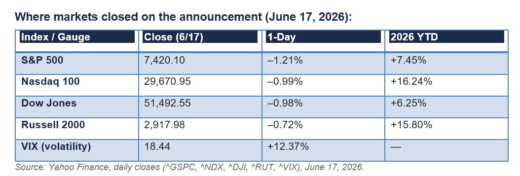
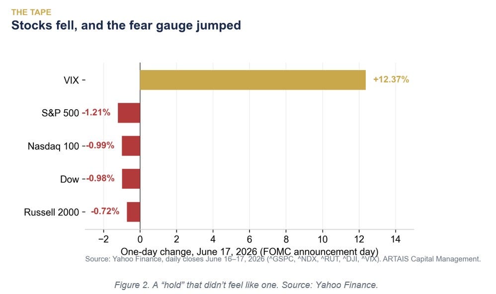
Stocks fell across the board and the VIX — the market’s fear gauge — jumped more than 12% in a single session, from 16.4 to 18.4.
That is the market repricing risk in real time. Not because rates moved, but because the Fed stopped telling investors what comes next.
What the Dot Plot Is, and Why a Missing Dot Matters
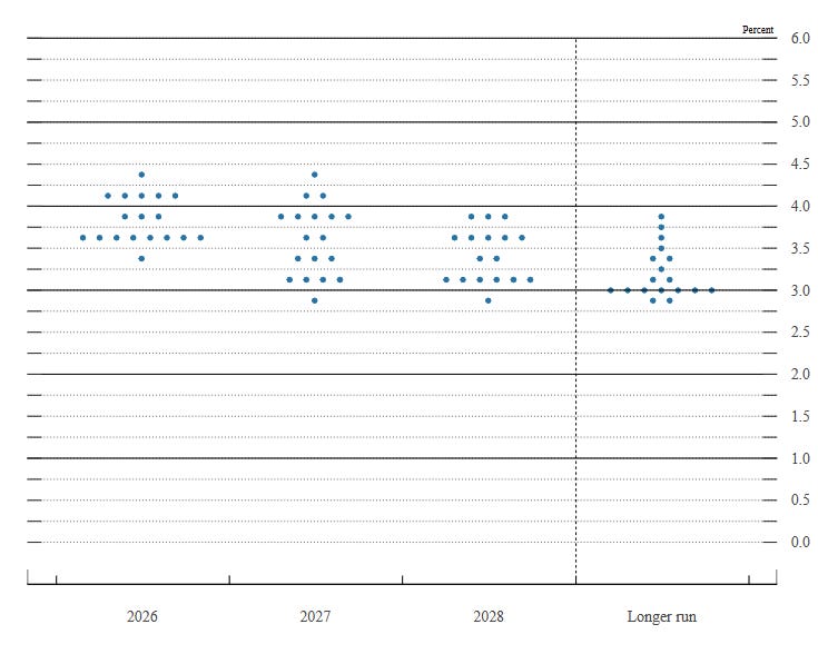
“Dot Plot” Source: FOMC
Four times a year, each of the Fed’s policymakers marks where they think the federal funds rate should be at the end of the next few years.
Those anonymous marks are plotted on a single chart — one dot per official — and the result is the famous “dot plot.”
The Fed introduced it on January 25, 2012, under Ben Bernanke, as a form of what he called aggressive forward guidance: a way to reassure markets, then pinned near zero, that rates would stay low.
The dot plot was never a promise. It is a snapshot of opinion, and it has often been wrong. But for fourteen years, traders have treated it as a roadmap — pricing bonds, mortgages, and equities off the median dot as if it were policy.
That is exactly the dependence Warsh wants to break.
At his first meeting, Warsh declined to submit his own dot.
Read that again: the Chair of the Federal Reserve did not tell the market where he thinks rates are going.
When the most important vote on the Committee goes blank, the median dot stops being a roadmap and starts being a guess about everyone except the person who matters most. This roadmap just lost its author.
The Case for Going Quiet
This was not unexpected. Warsh has argued for years that the post-2008 Fed talks too much.
In his view, constant guidance locks the Committee into stale forecasts and strips it of the flexibility to respond when the facts change.
At his Senate confirmation hearing, he was blunt: “I don’t believe in forward guidance. I don’t believe that I should be previewing for you what a future decision might be.”
His model is the Greenspan era of “constructive ambiguity” — a Fed that kept its cards close, let markets do the forecasting, and preserved room to maneuver. It is worth remembering how recent the transparency experiment actually is:
The Fed did not even announce its rate decisions until February 1994.
Press conferences did not begin until 2011.
The dot plot arrived in 2012.
For most of its history, the Fed said far less than it does today. Warsh is not inventing something new. He is going back to how the Fed operated for most of the modern era.
Does Transparency Actually Calm Markets?
Here is where the conventional story deserves a harder look. The case for transparency is intuitive: if markets understand the Fed’s intentions, long-term rates adjust smoothly, and policy works better.
Research from the Federal Reserve Bank of San Francisco links the rise of forward guidance to a secular decline in policy uncertainty, particularly when rates were stuck at zero.
But the long-run market record is messier than the theory.
I reviewed S&P 500 daily data across three distinct communication regimes and measured both annualized price return and annualized volatility. The result does not flatter the transparency thesis.
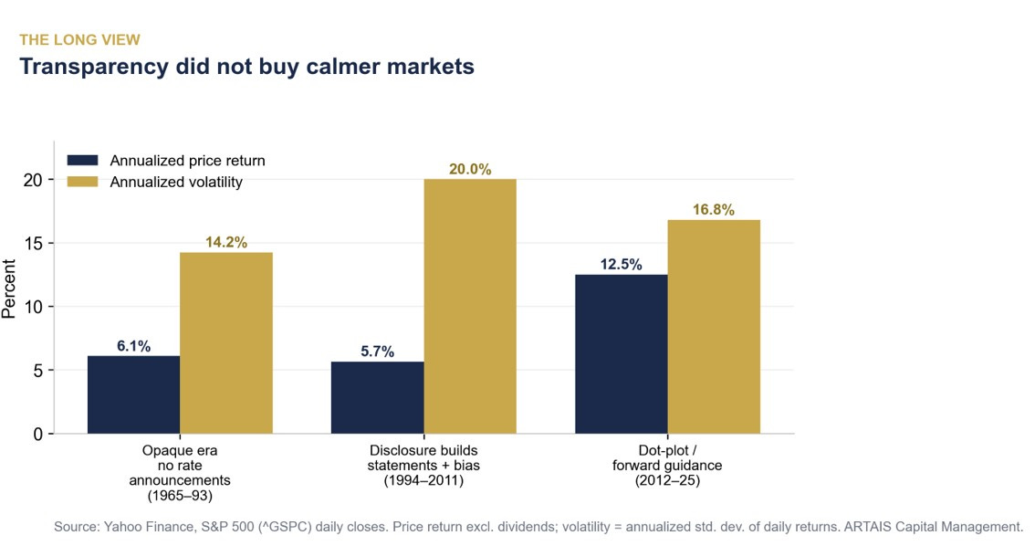
In the opaque era — 1965 to 1993, when the Fed did not even announce its decisions — the S&P 500 returned 6.1% annualized with volatility of 14.2%.
As the Fed grew more transparent from 1994 to 2011, volatility rose to 20.0%. Even in the dot-plot era (2012–25), with the strongest returns of the three (12.5%, powered by zero rates and quantitative easing), volatility ran at 16.8% — still above the quiet years.
The honest reading: communication style is not what drives long-run returns or even average volatility. The economy does.
Recessions, earnings, and credit cycles move markets far more than the length of a Fed statement.
The quietest Fed in the sample presided over the calmest market; the chattiest era contained the global financial crisis and the COVID crash.
Correlation, not causation. This should make anyone skeptical of the claim that more Fed talk equals safer markets.
More Volatility, But of a Specific Kind
So will less transparency mean more volatility? The likely answer is yes — but concentrated, not constant.
The research is consistent on the mechanism: uncertainty tends to spike on announcement days and ease in between.
Strip out forward guidance, and you remove the shock absorber that lets markets pre-position. Re-pricing that used to happen gradually now lands all at once — on meeting days, on jobs reports, on inflation prints.
Yesterday was a preview of what is to come.
A routine announcement that the Fed was holding rates steady produced a 12% jump in the VIX because the market had to reassess the path on the spot, with no guidance to lean on.
Expect more of this: calmer stretches between meetings, sharper reactions when the Fed actually speaks or when the data surprises.
For long-term investors, that is noise. For anyone using leverage or short time horizons, FOMC announcements just got a bit riskier.
The Uncertainty Regime: What Tends to Win, and What Tends to Lose
If the Fed will no longer telegraph its moves, the obvious question is what historically performs when rate uncertainty rises, and policy support gets quiet.
We do not have a clean Greenspan-era factor dataset, so the best modern analog is 2022 — the last time the Fed surprised markets with a faster, less predictable tightening than expected. The dispersion that year was enormous:
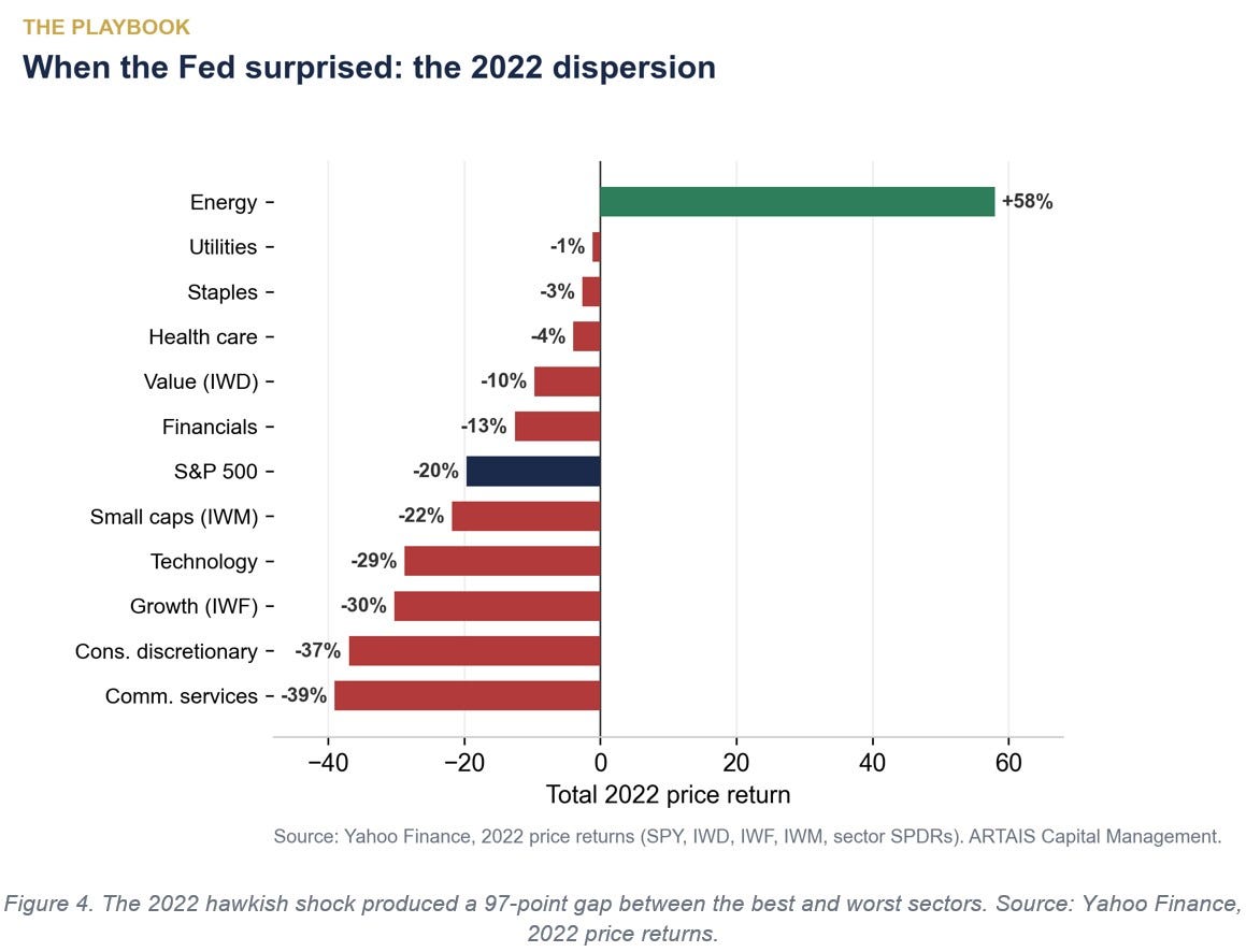
In 2022, energy gained 58% while communication services fell 39% and consumer discretionary fell 37%.
Long-duration growth stocks (IWF) lost 30%, more than three times the 9.7% decline in value (IWD).
Defensive sectors — utilities, staples, health care — fell low single digits or held flat.
The pattern is the classic uncertainty regime: short-duration, cash-generating, value-oriented assets hold up; long-duration growth and rate-sensitive corners take the brunt.
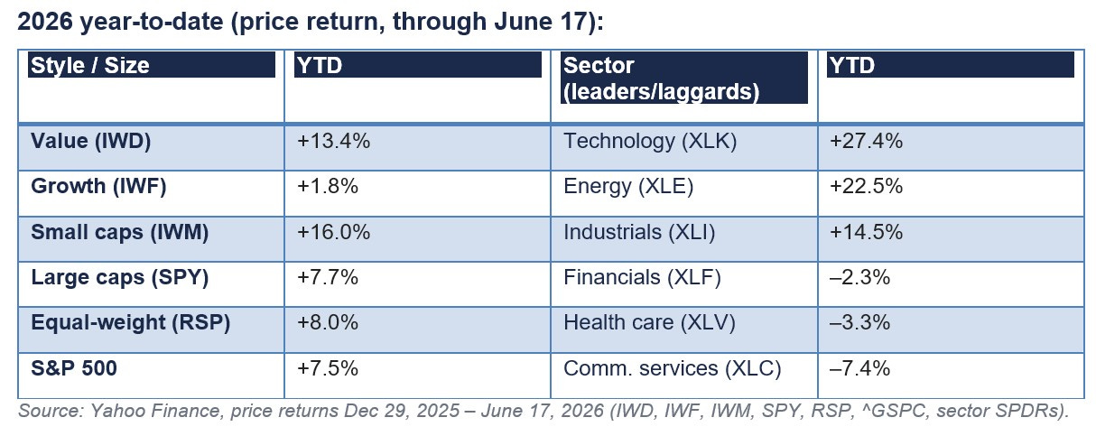
Notably, 2026 is already rhyming with that script. Through June 17, value (IWD) is up 13.4% while growth (IWF) has gained just 1.8%. Energy leads at +22.5%. The defensive-versus-speculative split is visible in the year-to-date numbers below:
None of this is a recommendation to buy or sell anything. It is a description of how markets have historically behaved when the Fed pulls back its guiding hand.
Leadership can rotate quickly, and 2026 is not 2022. But the direction of travel — toward dispersion, toward stock- and sector-level differentiation — is the environment a less transparent Fed tends to create.
Skeptic’s Corner
The bear case on this entire thesis is that the market is overreading one meeting.
Warsh withheld a single dot at a single FOMC; he may simply be establishing a tone and could resume fuller communication once his framework review is complete.
Markets adapt quickly — the 1994–2006 Fed was far less transparent than today’s, and equities compounded handsomely through most of it.
The VIX jumping to 18 is hardly a crisis; it sat below its long-run average of roughly 19–20 even after the move.
There is also a real case that less guidance is healthier.
A Fed that stops pretending to know the path may make fewer promises it has to break, and markets that stop front-running the dot plot may price risk more honestly.
And our own regime data cuts against the alarmist read: the most transparent era was not the calmest, and the quietest era was not the most volatile.
If communication style barely moved long-run volatility in the past, we should be humble about claiming it will dominate the next few years. The economy, not the eloquence of the Chair, remains the variable that matters most.